
Project Information:
Author: Ivana Moreno (me), Emilia Kaitazoff, Eleonora Zorzi
Teacher: Giorgio Baresi (Spark Reply)
Course: CAS 3 - Designing Advanced Services
SUPSI, MaInD, 2019/20
Tools Used:
Vector diagrams: Adobe Illustrator
Image editing: Adobe Photoshop
Prototype: Adobe XD
Video editing: Adobe Premiere
Abstract
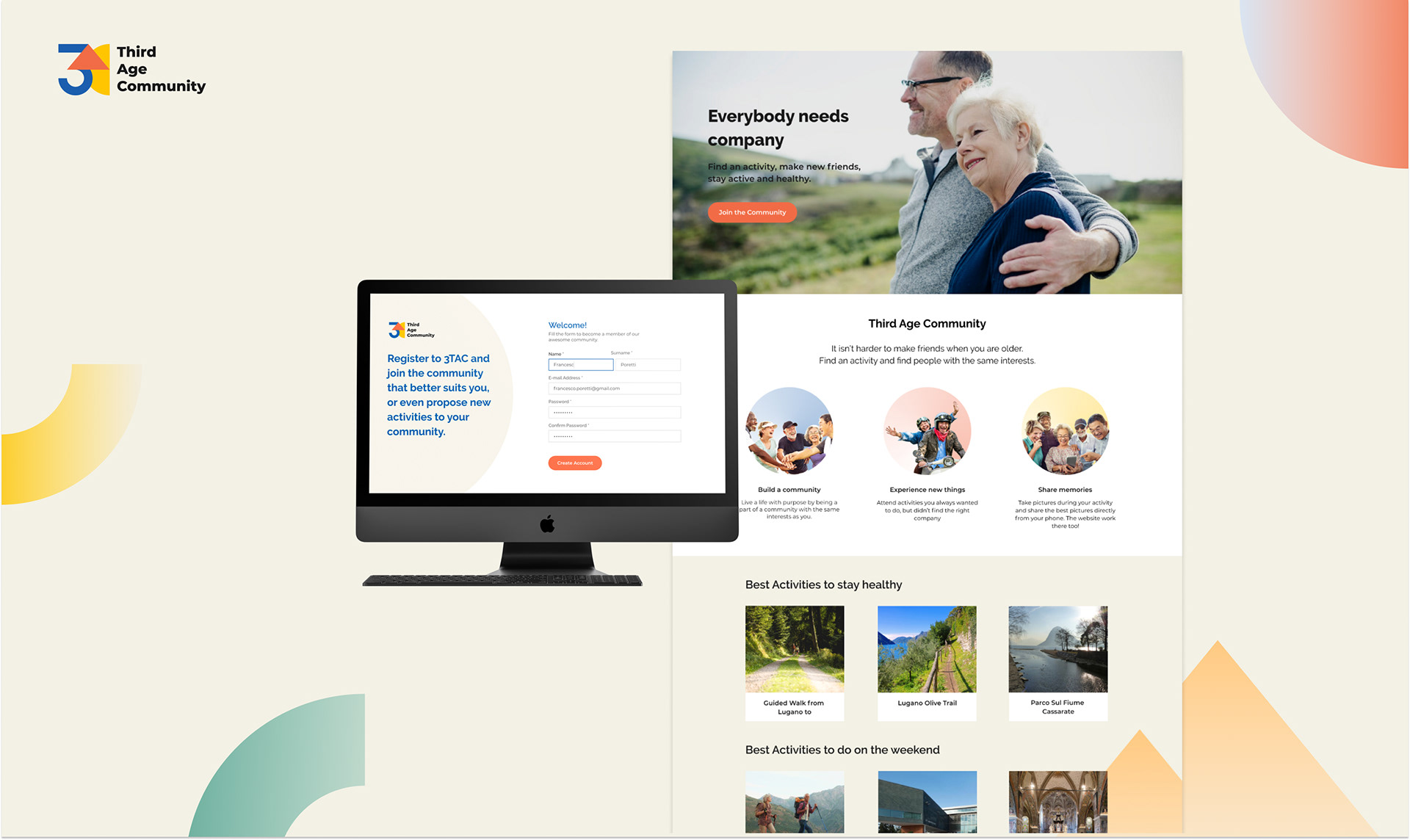
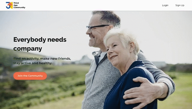
Third Age Community consists in a service to build communities and bring together active and more independent elderly people (older adults 65+) by activities of common interests and location. Connecting people through activities is an engaging way to help them during this period of their lives. By means of these activities, the user can stay healthy physically as well as mentally and emotionally.
Research and development context
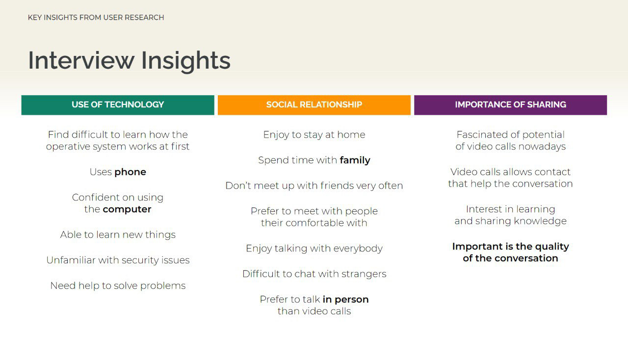
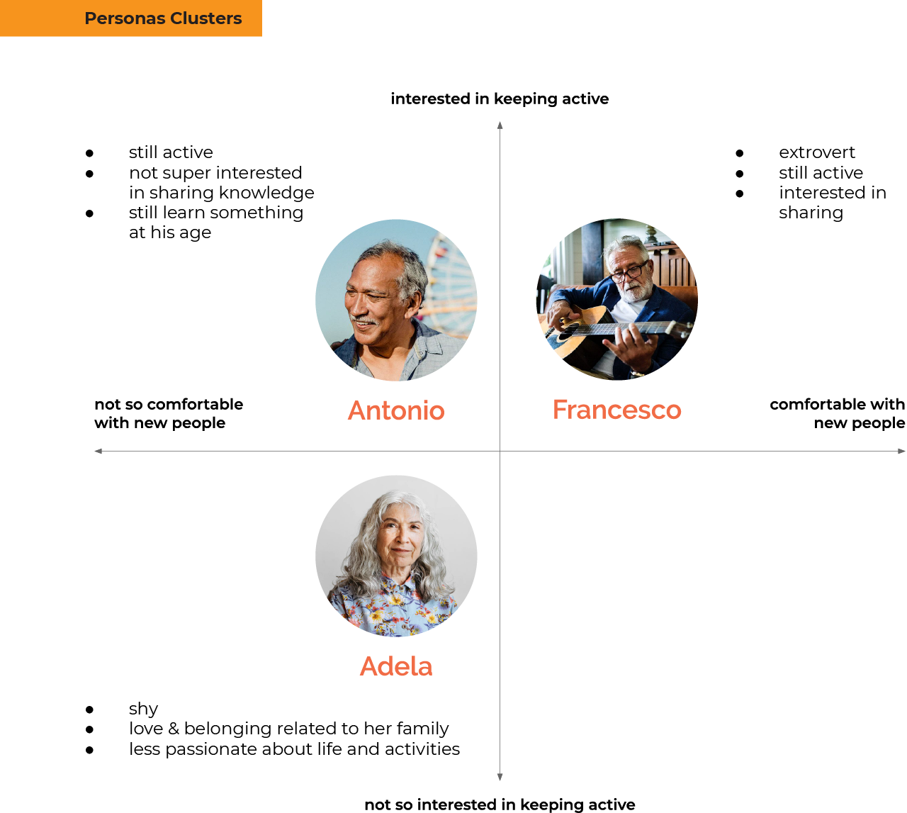
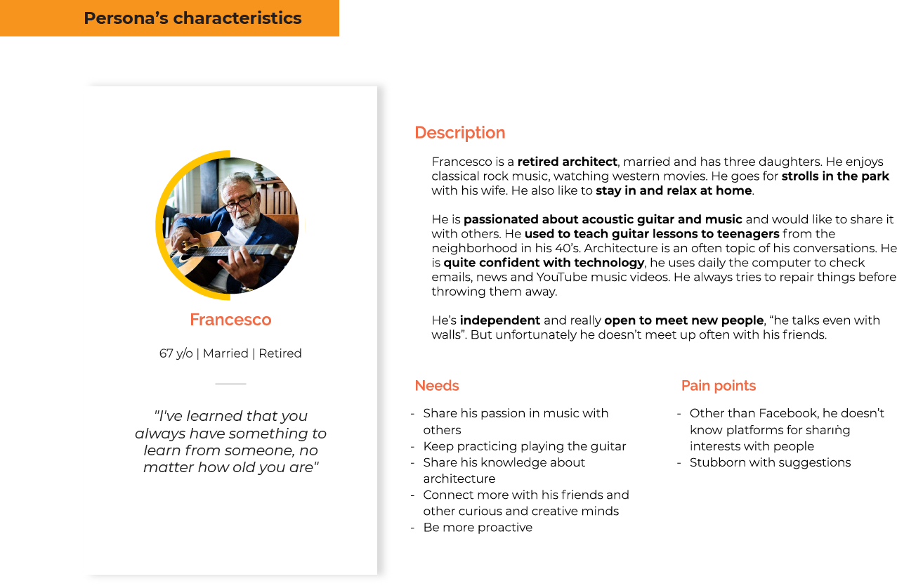
Our user target is more independent and wants to stay active. Our desk research showed us that the generation of baby boomers are more educated, savvy and individualistic when compared to the earlier generation. They have some normal downsides of aging but they focus on enjoying the upsides, like having more time to focus on what they love to do. A good example is the U-bend curve of life happiness, that shows that they tend to be more happy after mid-age crisis but it also depends on their emotional support in this phase. Other research reinforces the importance of friendship and a strong network on life quality during aging. So our focus mainly was on connecting people by eliminating distances and expanding their network.

Interface and Interaction modality
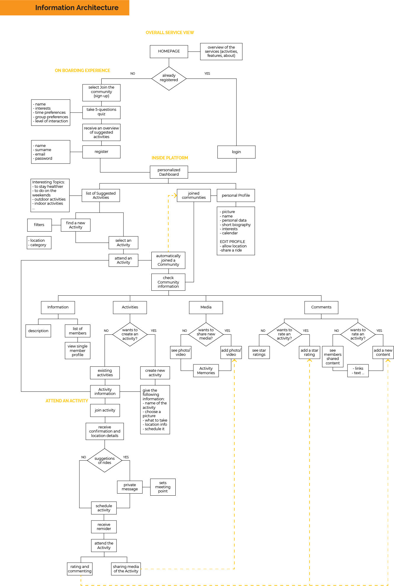
The interface of the service is clean and straightforward to provide good access to the activities. The homepage and dashboard have the intention to inspire seniors to connect and make friends through common interest activities.
Our brand is based on 3 main pillars: being friendly, helpful and energetic. Respect and kindness are priorities with our users, understanding they are still clever and active people.
We defined 3 primary colours that are used inside our service as well for the logo (that it is a combination of geometric shapes) and four secondary colours to have a broadened color wheel palette for others geometrical shapes application. We wanted to use warm and happy colours because often we forgot that also elderly people are still joyful. Using the red as ‘call to action’ colour, the rest of the palette applied in a more pastel way, for background purposes.
User experience
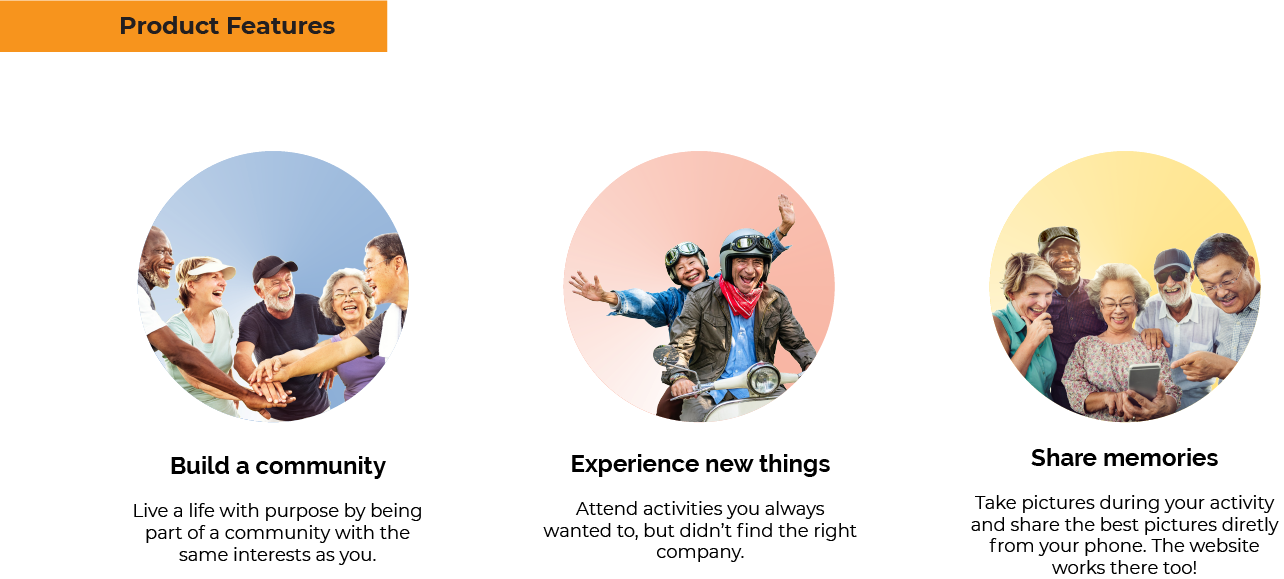
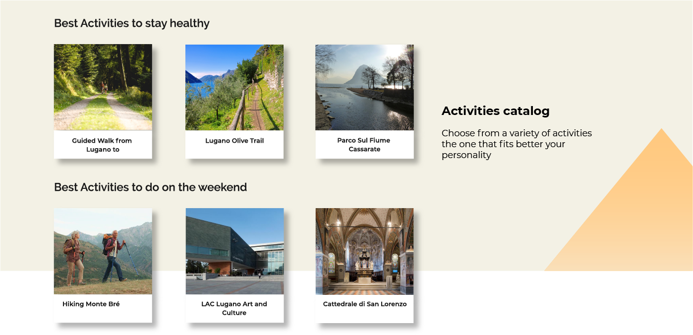
Third Age Community is elderly friendly and is focused on giving a more single-tasked experience. Building a sense of community between the members is essential, and by focusing on giving personalized suggestions of nearby activities, we give the user the opportunity of meeting other seniors that share the same interests. Our service provides a broad variety of activities, from more relaxing to more active experiences.
Further developments
The next steps would be developing the “hosting an activity” feature as well as developing other touchpoints like smartphone/tablet, smartwatches and home assistant devices, connecting more the user on his journey during one’s activity. Testing the prototype will help us with the iteration of our service. About the different possible application of the colours of the logo, it could be developed to change depending on the usage, also for advertisement purposes.